Resident Alien's illustrated intros are IKEA instruction manuals for extra-terrestrials

In the unlikely event of a UFO crash, human beings can be used as a flotation device...
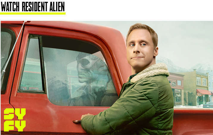
To say that Dr. Harry Vanderspeigle of SYFY's Resident Alien doesn't understand human behavior would be a gross understatement. The titular extra-terrestrial, whose form just so happens to look like Alan Tudyk, is completely out of his depth when it comes to grasping our Earthly idiosyncrasies. This comedic premise — a cosmic traveler attempting to learn how to emulate the native species — is what inspired Ben Hanbury of Huge Designs in London to come up with the pitch-perfect manual aesthetic for the opening titles of each episode that depict the "do's and don'ts" of bipedal culture.
"There's lots of moments where he gets it wrong and misreads situations," Hanbury, a 3D animator and graphic designer for the U.K.-based studio, tells SYFY WIRE. "I think those were our favorite bits of the show, so we thought, ‘Wouldn't it be quite funny to have a guidebook — a bit like when you're making some IKEA furniture?' Something where he can sort of follow the rules, but it's sometimes a bit confusing for Harry or other aliens to understand the nuances of life on Earth."
In particular, the designer focused on how furniture construction guides "will give you direct instructions on how to turn screws or how to assemble parts. Trying to work out what the visual language is to how you assemble things." He teases an upcoming title sequence that "involved going through a lot of old manuals and math equations to try to make it look more complex."
Of course, the airplane manuals you find next to the personal barf bag on any flight were also a big source of inspiration for the illustrated introductions. Serious question, though: Does anyone even read those anymore?
"They're a bit retro and we tried to keep the colors quite faded, so it would look a bit like those airplane-style cards," Hanbury explains. "Initially, we had it more as the idea of it being more of a guidebook, but I think it was decided from the first few examples that it looked too close to a comic and maybe audiences would be a bit confused about, ‘Well, is this the actual [Dark Horse] comic we're looking at?' We changed the format slightly so it was more like a fold-out pamphlet like you see on an airplane or something similar."
Before Hanbury's idea was chosen, however, the Huge team toyed with two other potential avenues. One involved a series of child-like drawings on Max's bedroom wall since the young boy (played by Judah Prehn) is the only person in the town of Patience who can see Harry's true form. The second axed idea involved "Harry's journey from his planet to Earth," Hanbury reveals. Head below to see some exclusive examples of the unused concepts. You can see even more goodies in the gallery at the very bottom of the article.
The manual pitch obviously won out in the end, but it really started to take root once creator/showrunner Chris Sheridan (Family Guy) became involved. Along with his executive assistant Silvio Cuadra, Sheridan helped Huge Designs refine each and every proposal down to its purest comedic essence.
"The challenge was trying to model and draw out what we'd think certain scenarios might look like and also how you present them in that infographic style way," Hanbury adds. "A lot of the time I was trying to Google different images and creating a little scrapbook of images to get the right composition or angle for the figures... In the first few episodes, we tried to cram quite a lot in and as we got towards the later episodes, we decided that it worked better to have one idea that was fleshed out a bit more. I think timing was definitely the challenge, but I think it was a good challenge because it helped keep everything quite condensed. It was a good way of purifying the idea, making sure everyone was on board, and that it worked together."
Certain suggestions continued to fall by the wayside as the creative process chugged along. For instance, "some of the earlier ideas had Harry being a bit more aggressive and mean-looking," Hanbury says. In another case, there was a human wearing a red hat a little too reminiscent of a certain former president.
"I think it was decided that would be too close to the bone, so we changed that slightly," the designer continues. "We had a few ideas that didn't really work when we saw them laid out. Often, when ideas didn't quite work, we just put them as panels on the side, so if you paused it, you might see it for a split second. It was generally a really fun process and I think most of the ideas got used in some way or another — of not as a main piece, then as a side thing."
While a second season hasn't been confirmed just yet, Hanbury is more than ready to whip up a fresh batch of humorous scenarios for the ever-expanding guidebook.
"It was a really enjoyable project and I'm hoping that the ideas continue into a Season 2. It would be fantastic," he admits. "I think we used the best ones for Season 1, but I'm sure there's plenty of directions they can go [in]. What I quite liked about the ideas in general is I felt that the more niche they got, the more interesting and funny they were. The nice thing about that is there are plenty more avenues and directions that you could pick up on [in regards to] the intricacies of humans and how we interact with each other."
For the time being, we float the idea that Huge Designs publish a book — or at the very least a pamphlet — containing all of the illustrations done so far. "That would be really good, wouldn't it?" Hanbury concludes. "It would be nice to see them all alongside [one another] because there are actually quite a lot now. I think maybe somewhere [along the line] we'll need to publish them as one big list. I think it'd be great."


