How Marvel's 'What If...?' is keeping the MCU's iconic look consistent while forging a new path
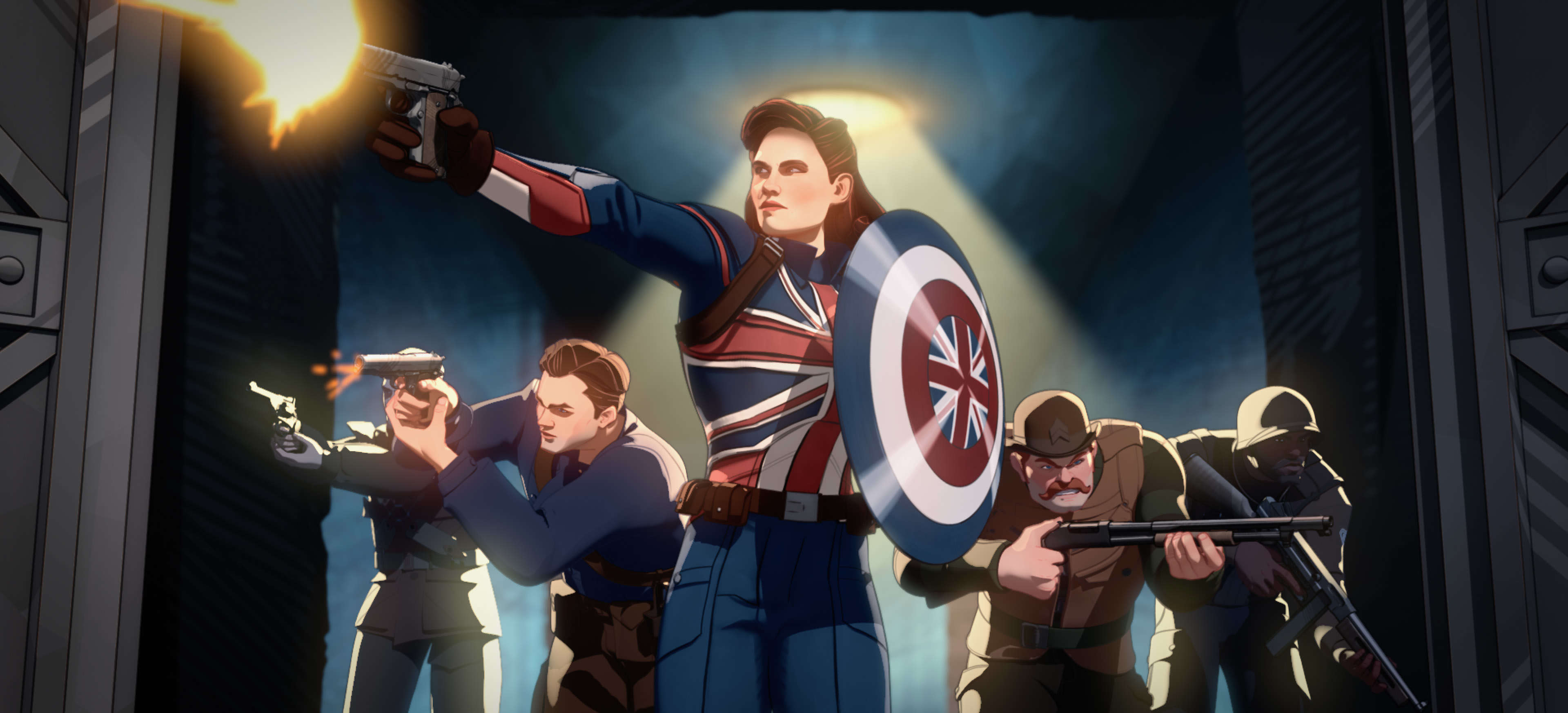
Divergent storylines abound in every episode of What If…? but the design and look of the Marvel Cinematic Universe remains consistent. It is all adapted to an animated format, but the general design lets viewers know that we’re still in the MCU — just a different version of it. Much of this is thanks to series Head of Visual Development and Character Design Ryan Meinerding. He keeps the look consistent, and it likely helps that he often serves as Head of Visual Development for Marvel Studios. From Avengers: Endgame, to Black Widow, to The Falcon and the Winter Soldier, to the upcoming Eternals and Thor: Love and Thunder, Meinerding has been involved. His love affair with the MCU actually goes all the way back to 2008 while working as an illustrator on Iron Man.
SYFY WIRE recently talked with Meinerding about his journey with Marvel, his biggest challenges, and every project’s own definition of “real.”
You've been with the MCU ever since Iron Man. How did you come to be involved?
I was fortunate enough to work with a Jon Favreau project previous to Iron Man, and he liked my work, and he recommended me to get hired on to Iron Man. So yeah, I was there at the beginning to work on the Mark I, which was actually the first film character I'd ever really worked on that got into a film. I was hugely fortunate to have worked on those projects, and I had no idea the trajectory of the studio or what was possible for my career. I'm very, very fortunate to have been part of it.
If you worked on the Mark I, it must've been something to see the Mark I in animated form in the very first episode of What If...?
Yeah, I have to admit, I probably brought more stuff from the Mark I over then another person would have if they were doing the design of the HYDRA Stomper. But that was a really fun one, trying to do something that looked like it was designed in the '40s by Howard Stark for the military, the notion of it being green but still having a star to sort of represent Steve, and also bringing a few other sort of classic Iron Man things that have appeared in the older comics but we didn't really reference in any of the films, like the antenna that he has and sort of the lines across the belt.
But yeah, the head and other shapes are definitely a little bit more on Mark I than maybe other people would have done. I was excited to be able to make it feel like Howard would probably design something similar to Tony.
The MCU has a great balance between the comic looks of the characters and something a little more realistic. How do you strike that balance?
It's one of the fun parts of the job, is each project's version of “real” is a little bit different, right? So we're usually trying to create something that feels real for the story world that the filmmakers are creating. So the idea of creating Captain America as a superhero of the 1940s, but it was essentially a super soldier that needed to feel a little bit of a soldier, meant that he was pulling together some patriotic stuff mixed with some practical stuff. And just to look at it through that lens is how we ended up doing the designs for the most part, right? If we had just gone with a pure comic thing, it would have maybe not felt like it felt real. It might not have felt period. It might not have felt sort of evocative of what that movie, the story world they were trying to create.
And I think another way I have of looking at it is, with the approach that we have, it's fun for me because the characters become... If you're seeing the characters represented in a number of different films, each design is about that film, and you see a visual story that starts to grow as their story grows, right? If we had just come up with a singular really iconic Captain America, and he was the same in every single film, we wouldn't be using all of the storytelling tools at our disposal to really talk about his journey.
Is there a character or a location over the years that has proved to be the biggest challenge for you?
Any of the digital characters are hugely challenging, especially characters like The Hulk and Thanos. Thanos was a big challenge because it was known pretty early on how much weight was going to hang on the performance of that digital character. It was challenging because in order to get it sort of pushed down the pipeline so that the amazing people at the visual effects houses could start actually bringing him to life, to get it approved was hard. But I think anytime that the challenge is that clear and it's that weighted, it's also something to rise to.
Is there any one particular design that you're more proud of than the others?
That's a very hard question to answer because I feel like what [head writer] A.C. Bradley and [producer] Brad Winderbaum and [director] Bryan Andrews set up as each one of these stories and the idea of each episode having its own kind of vibe to it, its own feeling to it, every character is interesting and compelling in a really cool way. I think, because of my background, having worked on the Captain America films and loving that time period and the fact that the style of the show references J.C. Leyendecker's work, which was also evocative of that time period, the work we were doing on Captain Carter and Steve and the HYDRA Stomper, I think, are some of my favorite things. And it was also the work that we were doing early on to help figure out the look of the show, so it's also sort of the first things that sort of just started to solidify the style and started to solidify the notion, like, yeah, this could work.
Are there any looks that you have wanted to do but for one reason or another have not been able to or allowed to?
No, I feel like the nature of the show is so much about the unrestricted and rampant creativity of, what if this or what if that or how can we do the most compelling and creative solution to a story problem or a visual problem, that there’s obviously all kinds of directions that the multiverse opens up possibilities towards. I think for me, it was just about trying to keep up with the creativity of what was going on in the stories and the episodes, right? We were doing our best to make sure that everything that we were doing, while still feeling like the branched timeline, ended up in something that felt iconic, right, that Captain Carter feels like her own character, and she's hugely iconic, and HYDRA Stomper and Star-Lord T'Challa all have this sense of feeling like icons.
With all of these characters, even in animation, we can identify them on silhouette alone. Is that kind of what you go for?
I mean, yeah. Obviously, in animation, the idea of being able to push certain things so that characters become more identifiable, more iconic, is clearly something that we're leaning into. We're doing our best to design things that sit within that Leyendecker style, represent the characters from the MCU as their own thing, and still be iconic.
Marvel's What If...? streams on Disney+ every Wednesday.
This interview was edited for length and clarity.
