Create a free profile to get unlimited access to exclusive videos, sweepstakes, and more!
Traveling through time with the Bill & Ted production designer

It has been nearly 30 years since audiences last spent time in San Dimas with Bill S. Preston Esq. (Alex Winter) and Ted "Theodore" Logan (Keanu Reeves). Of course, the high schoolers have previously ventured far beyond the city limits, traveling to ancient Greece and the Wild West and even Hell — the pair have really seen it all. Phone booths have become obsolete in the subsequent years, but the image of the BFFs crammed into that tiny space will never go out of date, as Bill & Ted Face the Music proves.
While nothing can break their unique friendship bond, the pressure of writing a world-uniting song against the clock is not easy to navigate. Luckily, their daughters Billie (Brigette Lundy-Paine) and Thea (Samara Weaving) are on hand to help. The future, past, and afterlife are all on the menu once again, which sees production designer Melanie Jones taking on the mammoth task of creating a pantheon of locations without leaving New Orleans. SYFY FANGRRLS recently caught up with Jones to discuss the challenge of building a freeway in a parking lot, designing the future, and the retro inspiration behind Death's pad.
Spoilers ahead for Bill & Ted Face the Music.
Jones was sent the script after Alex Winter had recommended her for the role. The pair had worked together on the 2015 YouTube project Smosh: The Movie that Winter directed. "I really want to hire you again," Jones recalled him saying after finishing this film. However, he has been predominantly directing documentaries, and this suggestion was born from this previous professional connection. "I kind of freaked out a little because I have seen the other movies," she said when her agent rang her about the interview opportunity.
Clicking with the script, Jones suggested a specific aesthetic for Death's (William Sadler) residence to reflect his character's arc and current midlife crisis. His relationship with Bill and Ted had a big impact, reflected in the evolution from the Bogus Journey gothic castle vibe. "I found some images of mid-century modern, very minimalist in the desert, something built into the rock that were painted black," she said. "And so I just brought that as a visual aid to have that conversation and they thought it was really funny." She took house inspiration from the iconic Stahl property in West Hollywood and the Peter Sellers 1968 movie The Party. "I thought it would be good for him to have a cool house, but it's not really that cool. He made it from wood, it's in Hell, it's all burned," she noted about Death's impractical choice of materials.
The color palette was also an early consideration. "The other two films were made in the '80s and early '90s, respectively. There was kind of a style and aesthetic of that time," she explained. "And I felt like we're in a different era now and they're more mature. I wanted to add to the drab feeling about their lives at the current time, things aren't going so great." Jones achieves this mood-setting vision by making sure the initial tone isn't too vibrant, before lifting it up as the movie progresses.
No matter what the project is, Jones approaches the material the same way, but she was aware of the expectations of this film. "It's a beloved franchise. These are beloved characters. So you want to do a good job, of course." Honoring the script was important, but this isn't a case of copying the first two installments. "We weren't denying the past. But we're not reliving it either."
Covering more than 10 time periods is a challenge, particularly when they stretch from 11,500 BC all the way to 7020 AD. Shooting on location in New Orleans meant that depicting certain historical buildings was made easier than if they were in Los Angeles, as it lends "itself to the various different kinds of architecture." These instances of having to change very little to hit the right note include pulling Mozart from a recital in 18th-century Vienna and swinging by Preservation Hall in New Orleans to pick up a young Louis Armstrong for their supergroup. Recreating George Washington crossing the Potomac required a lot more faking it. "We built a little stage pond and put a boat in it on our stage, got all the characters dressed up, and made some fake icebergs. Then they had to go in and VFX the background." The Babe Ruth sequence also used a similar setup, which the designer described as a fun process that involves "a lot of cheating."
Movie magic comes in many different forms, but for something like Bill & Ted Face the Music, the budget meant Jones had to be creative. This includes the massive freeway climactic sequence, which presented a difficult scenario to navigate. Scouting for a New Orleans freeway that could double for San Dimas came with "a laundry list of problems," including the logistics of a five-day shoot. After coming up short, Jones stood in the vast parking lot of the studio — that used to be a Lowe's but had been converted post-Hurricane Katrina. "I knew it would work. But it meant building a freeway, which was significant," she recalled. The overall process took about two weeks, using sculpted and painted foam (with a rebar structure inside) to mimic the pillars and the facade of the actual 210 Freeway.
The real test came when she presented the set to director Dean Parisot. "He goes, Oh, Melanie, you did it. Good for you. I'm really proud of you. This is great." She realized at this moment that childhood play laid the foundation, telling the director she used tape pieces of paper to make roads for her Hot Wheels cars in the 1970s. "I guess I was practicing for this," she noted.
Constructing contemporary San Dimas is not the only major concept she had to bring to life — she also envisions 700 years into the future. Parisot had a strong idea about what he wanted for this "bright, beautiful, sleek, and futuristic" landscape with a specific reference to the Spanish architect Santiago Calatrava — think the Oculus in New York City. First, they had to get clearance to use this imagery, and then Jones worked on the exterior. The set design is part building structure and floor — for when Bill and Ted steal the phone booth — combined with CGI.
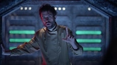
The hologram room below involved a broader conversation. "The only note I got for that was we want it to be this cocoon of darkness," said Jones. "So we can see the hologram of the earth falling apart." Unlike the idea behind Death's house that was signed off immediately, Jones had to go through a few iterations that matched what the director was looking for. Earlier versions were considered either too bright, too dorky, or too Star Trek. The generator for the hologram is the element in the middle of the room. "The rest of it I kept really simple, no embedded screens, no real knobs, no buttons even. It's more like a power plant."
Representing the dark underbelly of what has gone wrong on earth, she explained that "bad things happened down there." The set design reflects this mood, including introducing Dennis Caleb McCoy (Anthony Carrigan) in this room. Sure, he ends up being one of the movie's funniest characters, but the robot is originally sent on a mission to kill the beloved duo. "I have to have a story, a subtext, a reason. It can't just be an aesthetic choice. It really has to come from the story" is how she describes her approach to this set and her work in general.
Bill and Ted's time-traveling journey mostly consists of the same century they are living in, so the locations don't look too out of this world. For what hilariously turns out to be Dave Grohl's house, Jones put her experience making Netflix Mötley Crüe biopic The Dirt in 2018 to good use. The Dirt was also shot in New Orleans, and one of the properties they scouted (but didn't use for Nikki Sixx) was perfect for this film instead. "It feels like Southern California. That house could be in Beverly Hills," she explained. "That massive backyard and the lawn, the pool, and all of it. It's just so opulent, but you could also see Dave Grohl living there." Referring to it as "a bit of luck," the designer doesn't like to reuse locations if she can avoid it, so this worked out perfectly.
An old shut-down prison that Jones pre-scouted provided the location for Bill and Ted's encounter with the extremely hench versions of themselves. "That prison yard was timeless. It's just gray, repeating windows and oppressive," she said. "We weren't marrying ourselves to any time, it is more about the feel of the place." Because they filmed during the summer, the heat was unbearable at times, which was particularly hard for Winter and Reeves wearing the jacked prosthetics and the aging makeup.
To make things easier for the old people's home scenes, the older selves portion was shot on the soundstage to accommodate the makeup process. For the younger selves (including the encounter with Dennis), the modern medical lab building was ideal. Jones converted a conference room into a bedroom. "It had an entrance adjacent to the courtyard" that allows for the interplay between the interior and exterior action.
The weather proved challenging, and they even had to shut down on a couple of occasions. While it was a hard shoot at times, Jones has nothing but fond memories of this job. "It was undeniably one of the best experiences that I've had working on a movie." The family atmosphere that emanates from the shared Logan-Preston rehearsal garage space also existed behind the scenes. "All those guys were just such a pleasure to work with and really inclusive. Most of them had worked together before, I got brought on board and it was collaborative, it was a lot of fun." Additionally, she mentioned that everyone from the director, writers, producers, and stars had a common goal. "This is a group that cares about people, who care about the project, they care about these characters, each other, making sure you get it right," she said. "Having lots of conversations about it, thinking and rethinking. There's an open dialogue."
Referring to the scope of the different periods she had to conceive as "a really intense workout," she spoke about how invigorating this challenge was. "I got the opportunity to create all these different places." Before beginning any project, she asks, "What thing have I not done yet?" Rather than deciding by genre, the designer has avoided typecasting having worked on The Purge, Whiplash, the ABC sitcom Bless This Mess, and The Dirt. Referring to Bill & Ted Face the Music as "the pinnacle of this so far," getting to build hell and a freeway were bold new challenges. Because of the shutdown due to the global pandemic, this is the first time in four or five years that Jones has had a break, but she is itching to get back. She has taken the first steps, shooting a commercial, but she is "ready to work."
Regardless of the job, Jones' ethos doesn't change. "I approach all of it earnestly." This matches the uncynical and hopeful message at the heart of Bill & Ted. "What a blessing, what a gift to be on the ride and contribute to it," Jones said about crafting the look of this most triumphant world. From 18th-century Vienna to San Dimas 700 years in the future, the scale of the production is definitely an excellent adventure.


