How Nintendo’s first video game console, the Famicom, was inspired by a scarf
Nintendo and neckwear don’t exactly go hand in hand when it comes to what the famous Mario maker’s name evokes in people’s imaginations. When you think of the Big N these days, you’re far more likely to picture blue overalls, a little red cap, or even a rockin’ mustache.
But in strangely sartorial revelation of hidden Nintendo trivia, the design of the original Japanese home entertainment system that eventually launched Super Mario Bros. to U.S. stardom with the arrival of the Nintendo Entertainment System (NES) in 1985 was inspired not by any of Mario or Princess Peach’s fashion choices — but by a designer’s fascination with …a scarf.
Speaking with Kotaku for a far-ranging look back at the early days of home-based gaming, Nintendo hardware designer Masayuki Uemura said he had marching orders to create a game box for the Japan-only Famicom (Family Computer) — the 1983 system that evolved for the U.S. market into the NES — that incorporated the colors of a random scarf that had caught the eye of then-company president Hiroshi Yamauchi.
“The colors were based on a scarf Yamauchi liked. True story,” said Uemura. “There was also a product from a company called DX Antenna, a set-top TV antenna, that used the [same] color scheme. I recall riding with Yamauchi on the Hanshin expressway outside of Osaka and seeing a billboard for it, and Yamauchi saying, ‘That’s it! Those are our colors!’ Just like the scarf. We’d struggled with the color scheme. We knew what the shape would be, but couldn’t figure out what colors to make it. Then the DX Antenna’s colors decided it.”
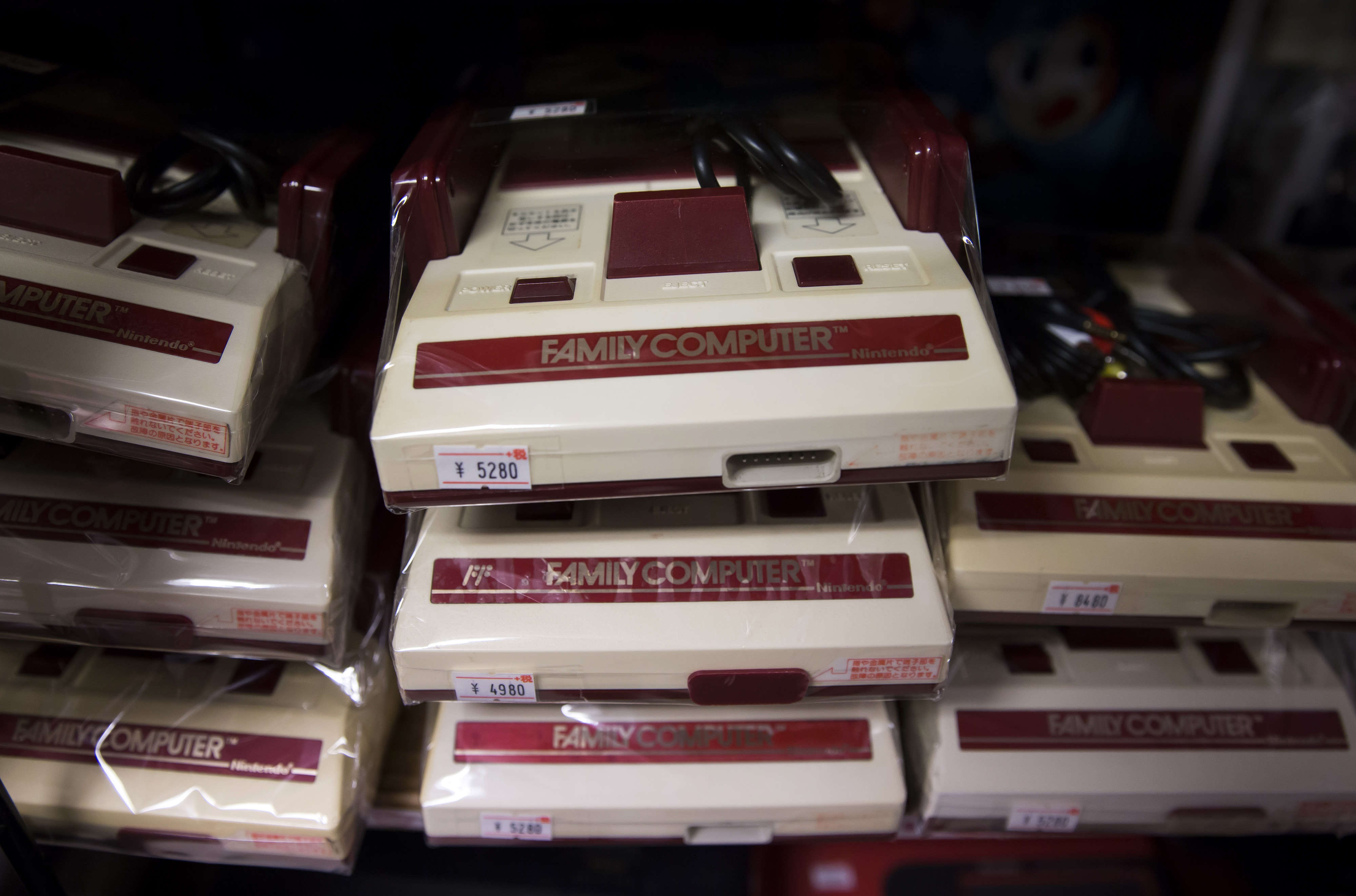
While it’s all but certain that Nintendo’s scarf of destiny has blown away with the winds of time, at least we have a good idea of its color scheme. The original Famicom — Nintendo’s first cartridge-based console — sported a sweet two-tone design that featured deep red embellishments against a light cream background, with the same red showing up on the plastic controllers, which were inlaid with gold-tone faceplates. By the time the Famicom was repurposed for the U.S. market as the NES, the color scheme had transformed into the now-iconic light & dark gray box, with the Nintendo logo itself (along with the controller’s A & B buttons) marking the only red to be found.
How’s that for a deep slice of Nintendo lore? Uemura also revealed that the company’s early shift from a maker of trading cards to compulsively playable Mario games came with a unique workplace culture, one where staff at the company’s Kyoto office got so invested in “researching” other studios’ ideas that playing video games almost became an obsessive pastime.
“In 1978, he [Yamauchi] bought around 10 tabletop versions of Space Invaders and placed them in headquarters and our factory. The idea was that we’d playtest them as a form of research,” Uemura recalled. “But what ended up happening was the entire company got so obsessed playing it that we couldn’t get a turn in. It was like a fever. Everyone abandoned their posts and stopped working. I was just bummed out that we hadn’t made it ourselves.”
Whatever fashion alchemy Nintendo tapped to create the original Famicom, it obviously worked. The console’s success in Japan led to even bigger success when it hit U.S. shores, and inspired console designs that continued to chart their own path — whether in the Nintendo 64’s swoopy curves, the GameCube’s compact boxiness, the Wii’s angular profile, or the Switch’s sleek portability. So thanks, Nintendo … we’ll never be able to look at neckwear the same way again.


