Create a free profile to get unlimited access to exclusive videos, sweepstakes, and more!
James Cameron on why Aliens' original theatrical poster was just an 'all-black frame'
You can chalk it up to a Hollywood marketing executive who didn't understand sarcasm.
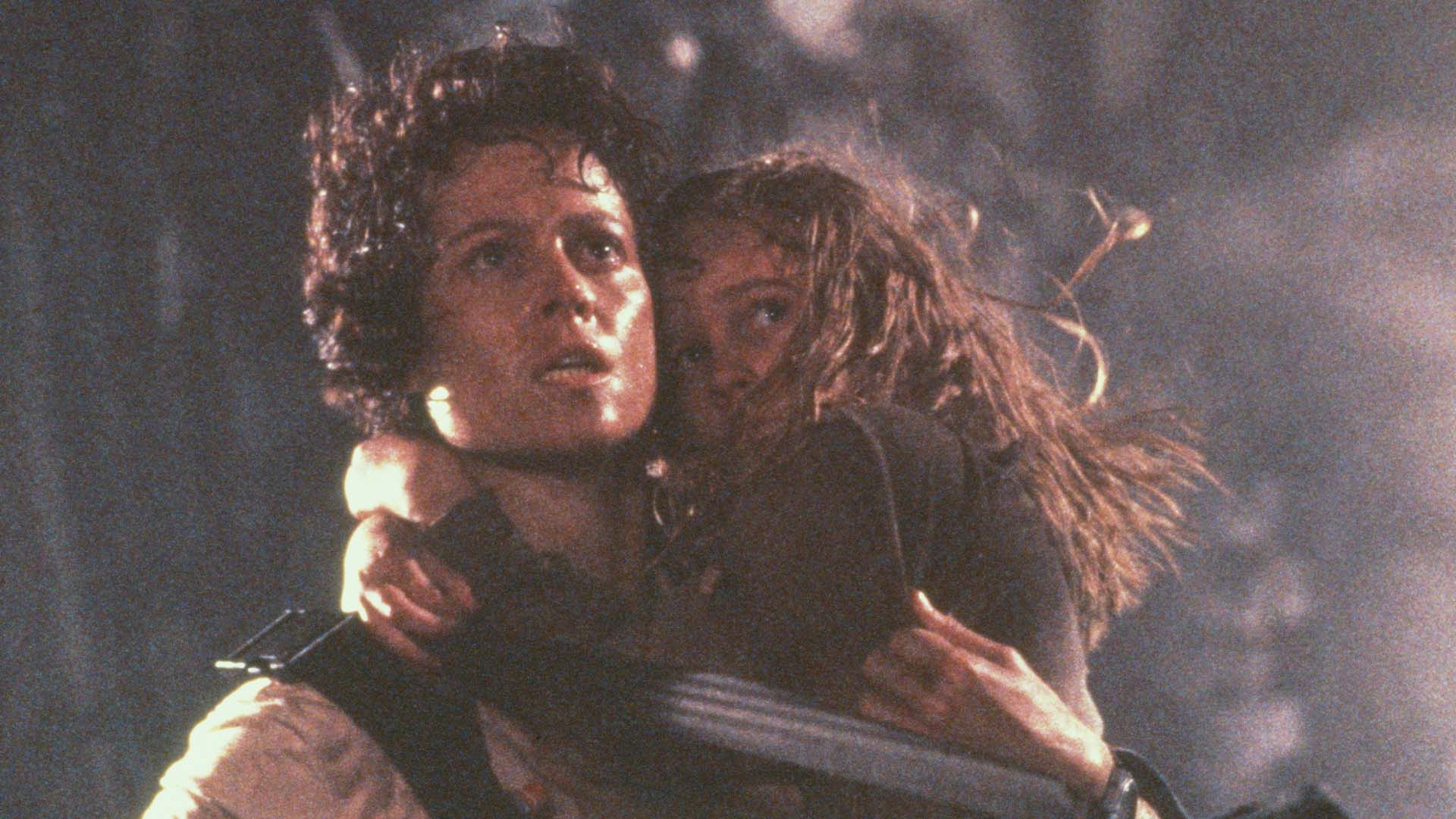
Ever wonder why the original theatrical poster for James Cameron's Aliens is so...underwhelming? The decision to go with a basic black triangle containing the title, taglines, and cast and crew did not come out of a desire to project a sense of dread or mystery onto the viewer. In fact, it wasn't anything close to that. According to Cameron, the humdrum design was the result of a Hollywood marketing executive who did not understand the concept of sarcasm.
Recently hopping on a Zoom call with a limited number of press outlets (including SYFY WIRE) to discuss his new book — Tech Noir — the Oscar-winning filmmaker recalled the story of how he stopped by the offices of 20th Century Fox to meet with the head of publicity to see how promotion was coming along for his action-horror sequel to Ridley Scott's Alien.
"I literally met him on his last day in the office," Cameron said. "His office was all boxed up, I was his last meeting before he left the job. He was sitting at the desk and he had this little green plastic frog and he was squeezing [it] and making it hop around the desk. I said, ‘What’s with the frog?’ And he said, ‘It’s my stress frog.’ I’m like, ‘OK, this guy is a casualty.’ He said, ‘But I’ve got a one-sheet for you.’"
Cameron described the initial poster that was shown to him as "this horrible sort of mashup photography; it looked worse than a Roger Corman one-sheet. Because, like me, Roger believed in good one-sheets. Not good movies, but good one-sheets."
Never one to mince words, the filmmaker was brutally honest with his feedback:
"I looked at this thing and held it in one hand and then I said, ‘Let me tell you exactly what I think of this one-sheet.’ And then I just slowly crumpled it up in a ball and threw it in the corner. He was working the stress frog and I said, ‘Honestly, if I had a choice between that piece of sheet and just an all-black frame, I’d go with the all-black frame.’ Apparently, what happened is, I walked out of the office and he called somebody up and said, ‘HE WANTS IT ALL BLACK!’ He wasn’t hearing what I was saying. So, if you ever wonder why there was literally nothing on the one-sheet for Aliens, that’s why."
He would face a slightly similar predicament several decades later in the run-up to 2009's Avatar (aka the highest-grossing movie in box office history). This time, however, Cameron's status as one of the most respected and visionary storytellers in the entertainment industry granted him a greater say over the look of the film's marketing materials.
"I think on Avatar, there was one more where [the studio] missed it and we actually brought in Dylan Cole, who is one of our designers, and Dylan did the one-sheets for Avatar believe it or not," Cameron said. "We literally just did it in our own design department. So I did believe in the one-sheet the same way I used to believe in the book covers of all those science fiction books I used to buy as a kid. If it was a good cover, I bought the book. So, I believe in the principle of the one-sheet."
Tech Noir: The Art of James Cameron is now on sale from Insight Editions for $75.

