Create a free profile to get unlimited access to exclusive videos, sweepstakes, and more!
How to redesign Godzilla monsters, Star Trek and other icons without 'ruining childhoods'
After spending years on Broadway, Scott Chambliss connected with an up-and-coming TV producer named J.J. Abrams and decided that it might be fun to try his hand at building worlds meant for the screen instead of the stage. It turned out to be a solid dice roll; after starting with Abrams as the production designer on Alias, Chambliss became one of Abrams' closest collaborators, and as the filmmaker rose through Hollywood and the blockbuster food chain, Chambliss established himself as a go-to artist for some of the world's biggest genre extravaganzas.
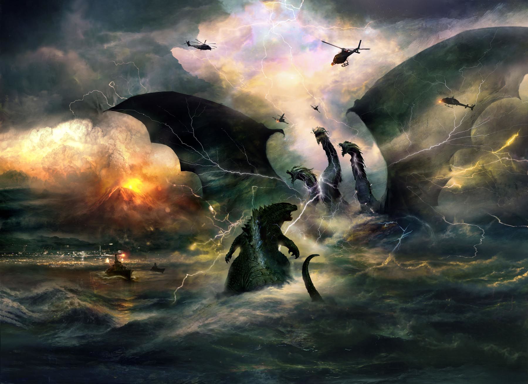
Chambliss' credits as production designer include the Star Trek reboot series, Guardians of the Galaxy Vol. 2, and, most recently, the upcoming kaiju mashup Godzilla: King of the Monsters. On that film, which was directed by Michael Dougherty, Chambliss also worked heavily on the creature designs, helping reimagine the classic monsters King Ghidorah, Mothra, and Rodan to match the tone of Legendary's MonsterVerse series.
Chambliss spoke to SYFY WIRE about his work on the monsters, Star Trek, Guardians, and more, and shared some of his gorgeous concept work for Godzilla: King of the Monsters as well.
Production designers aren't always so involved in creature design. How'd you become integral to it?
Michael Dougherty, the director, and his writing partner, Zach Shields, they wanted to bring on a production designer who would be kind of a team leader in the redevelopment of these monsters, with the idea that it was basically my responsibility to come at it from the point of view of a production designer, as opposed to a creature fanatic or a creature designer.
My job is "Okay, what's the story that we're telling?" Usually it's in the environments, but even with creatures, it's the same story you're telling. What is it about their creatures, and what are their characteristics? What's specific to them? What's unique? Let's really pinpoint their personalities and discover what the visual cues to that are that will help evolve the design of each of the creatures that we were touching.
How much freedom did you have?
We had as much as we wanted. And one of the things about this, it was kind of like when J.J. and I were approaching Star Trek, the whole point of view the first time was "We're going to take the material seriously and really pay tribute to what Roddenberry's intentions were." The starship Enterprise, of course, was the big icon of the show. We had to take that seriously in terms of what it represented, but that didn't in any way mean that we had to reproduce it literally or just tweak it a little bit and send it off again.
It's that same kind of respect that Michael wanted to pay to monsters. He's a huge monster fan, he always has been. And Toho as well has a list of guidelines of how the creatures are when they're redeveloped, what's okay and what's not okay.
Fortunately, the things that they were insistent upon were really the DNA of the monsters themselves. There wasn't anything specific to any one of the specific designs over the years. But we had that, which wasn't a hindrance at all, and then we had the great freedom to take Ghidorah, Mothra, and Rodan from the last time we saw them, which was quite a while ago, and bring them into current day — not only with technology and the looks and feel of movies, but also current-day points of view on monsters. We continue to have so many different kinds of monsters in our entertainment these days, and some are massively popular, like with Game of Thrones.
Part of the task, in addition to being true to the characters and developing them even further than they did develop before, was to find what continues to distinguish them from all the other creatures we've been staring at for the last 15 years.
What constitutes the monsters' DNA? Was there anything Toho was adamant about?
They wanted to keep relatively the same color palette for Mothra. We had a certain amount of leeway with all of them. We weren't going to touch Godzilla too much from the 2014 version, because Michael is really pretty happy with Garth's development of that. But because this is Michael's dream job, he had some things he wanted to do, some specific tweaks and touches with Godzilla that we accomplished in this. So he's evolved a bit from 2014.
The one that Michael was initially going the farthest afield with was Rodan, in taking him out of dinosaur language and making him more closely related to vultures, which was a really interesting starting point for it. And ultimately, I think, when you look at the creature you can see, obviously, the bird influence that was there in the early stages, and hopefully it helps freshen up the look of that guy.
It helps that they've changed the looks of these monsters in almost every movie.
That's really true. It's something we did for Godzilla and we did for all the creatures. We manifested the natural characteristic of how they go into action, what happens to their very bodies as they're prepping — Ghidorah spews her thunder and lightning, and Rodin breathes fire, and Godzilla has his atomic volcano coming out of him, and Mothra has her own special thing, which I don't want to ruin. But our point was, we want to show it beginning to course through their bodies visually, not just interior, but have an exterior manifestation.
For specific to Godzilla, Michael's tweaks were really the tweaks of a connoisseur. He changed some of the fins on the back, and he altered a foot shape here, and he did a little something to the face. Just minor things to satisfy his own taste, nothing really super big.
In your career, what's been the hardest thing to update?
Well, it depends on who you ask. If you ask me, I think that we've done pretty well with them. But some people who are real purists about one aspect or another of what they consider the original, inviolable elements get pissed off if you move a chair. So I think the one that I've gotten the most s*** about was in the Star Trek series, showing that the Enterprise actually runs on beer.
Which you did because you shot at a brewery, right?
I've only gotten hate mail one time in my life, and that was it, like, "How could you portray part of the Enterprise engine room as a brewery, for hell's sake?" Because it looked great, and it didn't really look like that now, did it? Would you have known if you hadn't read the notes?
You worked in the practical set there! On your website's section for Guardians of the Galaxy Vol. 2, there's a design for a drill ship, and you make a note that says basically, maybe it could work this way. So you're not just designing something that looks cool, you're also designing, to some degree, things that have to “work.” How much does that come into play when you're designing?
It's always in play, because we have to make it believable and accessible. So there's no bullsh***ing your way around and succeeding. That's fun. We get to make up so much s**t, you know? In this job of worldbuilding on the big shows and Godzilla, of finding a kind of epic, fantastic visual sweep to tell a crazy huge-scale monster tale in what's supposed to be the real world that we live in. That's a different kind of challenge, but equally rich.
When you are rendering sets through CGI, there are no limitations to what you can do, while practically built sets come with inherent rules. How much does that impact your designs?
Using CG as part of creating an environment is just one of the toolbox elements. At this point in design development and feature, CG has been such a huge presence for, what, 20, 30 years now? And when I'm conceiving of a set or an environment for a film, I'm not right off the bat thinking, "Oh, this is built, this is CG," unless, of course, it's in outer space or it's anti-gravity or whatever. But ultimately what it comes down to for me and for most of us is that whatever circumstance is going to anchor the story best and tell it the most articulately is the direction that we're going to head. And you don't always know what that is right off the bat.
Like in the Godzilla movie, we have a set piece that takes place in the Antarctic, and in the beginning we were exploring, "Well, do we actually go to a snowfield, an ice cap, something like that, and get some of our big conflict footage there? And then we match what we need to for close-ups on stages, and then we tie that into a visual effects world.” And at the end of the day, we ultimately decided that we would have more control and be able to make our days if we did all of that on a soundstage.
So we built the piece of the big exterior setting that we needed, and we covered a whole stage floor in Atlanta with our fake snowdrifts and dressing out there and did it that way. And then we're able to piece large chunks into it with the CG extension of that entire world. Sometimes entire sets go CG and you just end up making little platforms and entrances and exits, and other times it's a combination of the two. It becomes very dependent on the circumstance.
It's all about problem-solving as you go. Has there been a problem particularly hard to solve?
The hardest ones to solve are the ideas that never seem quite to work that have to do with big set pieces. You go around and around and around and around until finally time's out, money's running out, and you have to bite the bullet and do something. The ones that I always look back on, there are two of them in Star Trek Into Darkness.
One of them starts the movie, that run through the red jungle on the red planet. In the original script, that was a huge set piece that opened the movie. It was a really elaborate environment of a planet native village and a high priest ceremony and all this stuff going on. And I designed all of that with my team. We got it far down the road. The costume designer did as well, he had a whole costume shop full of designs that he was working on. And the numbers kept rolling in for the whole film. And time after time after time we were looking for big chunks to take out of the movie, so what started as a “wow” of a way to open a movie turned into a “really fast run and a jump off a cliff.” And finding a satisfying way to make it that didn't feel like a disappointing way to start a movie was a tough one.
And the other one?
It's about halfway into the story, or maybe a little bit more, in our small speeder vehicle that looks like a dish. They're going through this abandoned part of an old planetary city. It's very constructivist and angular-looking. And they crash down, and there's a fight. And Benedict Cumberbatch has got some big-ass gun in front of a gigantic yellow lamp. It was an environment we could never quite figure out exactly what we wanted the story to be. And at the end of the day, we kind of worked backward. It's like, "Okay, this needs to basically be a playground for this to happen, this to happen, him to jump from somewhere and that to happen ..."
So one of the dozen or so concepts that I kicked out earlier was taking a look at the Roman Colosseum, what remains of it, anyway. That part that's down at the base, which used to be the warren where all the lions were held, the animals and the gladiators, the people who were about to be fought or eaten or whatever. And think of that as a kind of environment that we were in.
That appealed to J.J. We were able to make quick block models of how all the fighting and staging could work, and then we built the story around that based on "Okay, this is a ruin of this civilization on this planet, and its function used to be blah, blah, blah." And because that happened so late in the day and the money was an issue, I was never really satisfied that we got the richest environment and story that we could have. But at the end of the day, I don't think it did serious damage to the storytelling.


