Emmy Contender: How Russian Doll haunted the East Village and killed Nadia over and over

Welcome to Emmy Contenders 2019. This month, SYFY WIRE is speaking to a long list of actors, artists, and artisans whose work earned them Emmy nominations this year. Today we speak with Chris Teague, the Emmy-nominated cinematographer for Netflix's Russian Doll.
The East Village is dying. People have been saying it for generations, but now it's finally true. New York's den of freaks, artists, and longtime locals is being razed and remodeled at a record rate, with neighborhood staples and century-old buildings falling at an unprecedented pace, even for a city that is constantly being reinvented. Sidewalk Cafe on Avenue A shut down this February, around the same time that the Hell's Angels finally abandoned the clubhouse they fought so hard (legally or otherwise) to secure. Big glass condos rise as memories of neighborhood haunts are left to the ghosts.
For the remaining locals, as things slowly change, the past seems more and more important, as if imbued with some sort of deeper message that might help reclaim the present. It's a grim reality, but it also made it the perfect setting for Russian Doll, the surprise Netflix hit from co-creators Leslye Heyland and star Natasha Lyonne.
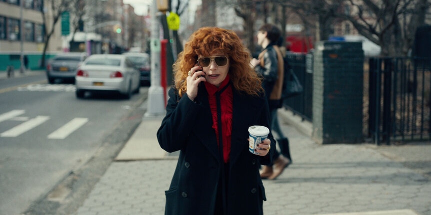
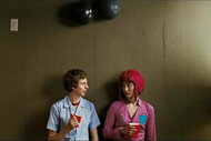
The series, which is nominated for an armful of Emmys, follows Lyonne's character Nadia, a hard-drinking, harder-living native New Yorker, through a comically violent Groundhog's Day in the East Village. Each day begins at her birthday party in her friend Maxine's giant loft apartment and ends with a violent accidental death, forcing her to unlock a mystery and confront her demons, of which she has many. It's bathed in neon lights and graffiti, set in modern apartments within ancient-for-New York buildings, giving it a unique sci-fi street noir feel. Russian Doll's cinematographer, Chris Teague, is nominated for an Emmy for his work on the show, and he spoke to SYFY WIRE about how the team achieved its Lou Reed-meets-Blade Runner look and how they handled the show's many deaths.
It felt both like an old version of the East Village and like a sci-fi version of the East Village, like these alternate realities of that neighborhood. I'm wondering how you collaborated with production design and everyone else to create these alternate versions of the Village.
That part of New York, in particular, especially has so much to draw from in terms of color, light and shadow. And so there's a lot of inspiration existing in the space. For me, I've done so many projects in New York City. It was great to have an opportunity to do something that treated the city in a different way and pushed a sense that, in some ways embraced the realism, and in some ways it pushed against it.
Obviously, Maxine's loft is a central location in the show, the heart of the show. That was our control point for how we built the look of the show. And then it became about how do we bring that out into the streets? [Production designer] Michael Bricker is an incredible collaborator, a production designer, brought so many ideas to the table. And working with him and [showrunner] Leslye Heyland and Natasha and the whole team, we built this color palette that we really liked based off of a lot of reference images from movies and photography and art.
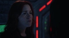
What I ended up doing is taking all those reference images and pulling color swatches from the images themselves and just focusing on the colors that I thought felt should be in the world of the show. There's a lot of deep reds and blue greens and fluorescent industrial greens and way more saturated color than I've ever used in any other project before. And I think that it does lend itself a sci-fi feel.
And a version of it that doesn't exist anymore.
That changes the way you look at the city. When you look around, you look at all the existing color and the storefronts and the metal halide industrial lamps that are outside of apartment buildings. You try to take advantage of those when you're scouting locations and picking your backgrounds. And then you also try to bring some of that out, like some of those looks from Maxine's loft out into New York City. And we did that a lot with these great LED fluorescent tubes. These are RGB fluorescent tubes called Astera X and sky panels as well.
We use these kind of programmable, multi-color lights where we can build in all our looks. And I handed this swatch of colors to Joel Minnich and he took that and he dialed in all the colors into these lights before we started shooting, so that we could go on the set and drop in a particular red or a particular green or blue and add those into the backgrounds when we felt like we needed some color contrast or just a little bit of life in the frame. So it was about taking what was already there on the streets and then seeing how we could take advantage of it and then also add to it. So to create an immersive world that is actually our real world, but also give it this unified aesthetic, is an interesting challenge to try.
New York is so varied, so to sort of give it a unified aesthetic is definitely an interesting challenge.
Yeah, and the fact that there are so many different environments. Tompkins Square Park, for example, is really monochromatic. I mean, it's all sodium-vapor lighting. And that's changing now. They're switching out street lamps to LEDs. So the color on the streets in New York is kind of slowly changing over. But in certain locations like Tompkins Square Park, which is obviously a huge location for us, in some ways fit the show because there's something kind of eerie about that color. But it was also sort of too monochromatic for us.
Because sodium-vapors tend to go amber red, we were trying to push cyan, either highlights or washes of color, into those shots as well, just to keep it within Russian Doll territory. Which is not an easy thing to do on a tight timeline and a limited budget. A lot of it is trying to work with what you have in front of you. But it was important to try to maintain that wherever we were as much as we could.
You have some wide shots, but a lot of the show is tight shots either following Natasha as she's running or she's running towards the camera. And I think that was another great way of making it... I want to say claustrophobic, but its own little world.
Nadia has so much energy and she's like a ... I think of her as like a freight train of a character. She's just constantly searching and she's an investigator, right? And she's on this journey and she moves with such force, that we wanted to help kind of convey that with the way we move the camera. There's times when we stepped back from that. And that's always important when you're making a film or TV to have a contrast and balance. But there's so much that's dictated by the storytelling that, as Nadia's constantly propelling herself forward to try to figure out what's happening to her and discovering all these new clues along the way.
So it was a lot of Steadicam work, moving with her, bringing her into spaces and trying to combine shots where we'd bring her into a room and then it would turn into a wide or turn into somebody's close-up. And I like that as a style of filmmaking, in general. I like master shots that combine a lot of different frames into one shot. I think it's just always more fun and dynamic. And this show really lent itself to that. As for being claustrophobic ... part of that comes from the lenses that we were using where we were shooting very wide aperture lenses, which often can have the backgrounds fall way out of focus. And it created a real separation from Nadia and her environment in particular moments and I felt was appropriate for the show as well.
It takes a while to figure out what exactly is happening to Nadia, and people figure out at different times. How did you go about dropping visual hints, without giving away too much?
There are all these clues that were really prop-based or production time-based, like with the rotting food and the rotting flowers. So that became a challenge: how do we incorporate these things into our frames? And are we really pointing a finger at them and to the audience and letting them know?
The second episode ending that moves off of Nadia onto some rotting flowers, and it's an indication something else is going on under the surface. So that's a moment where, if that was just in a frame, we would never have seen it. There's another moment when Nadia goes over to Beatrice's apartment with Alan [Charlie Barnett] and there's rotting fruit on her table. And we didn't point too strongly a finger at that, but it's there in the center of the frame and one of the wide shots. I think Nadia notices the fruit in the bodega and we dip down to that and then come back up to her. So that's a nice moment where we're noticing something's awry.
It's sort of a moment-to-moment thing about how much do we need to clue an audience into this? If you really make too big a deal out of it, then I feel like it can sidetrack the audience. But if you give them just enough of a hint of it, it can really give them a sense that there's multiple narratives or multiple kinds of themes going on that they can tap into.
The deaths were another important element, and you had to present them in so many different ways. Did you shoot them a few times and show different angles and edits of the master, or did you film them over and over, to keep them fresh and different?
That was, I think, the biggest challenge of the show for me. And one of the things that we spent the most time weighing how each one of those would play out on camera. There are so many challenges to it. There's the question of how are we depicting this depth in terms of, is this one funny? Is this one horrifying? Because each one is different. So there's that aspect of it. How do we want our audience to respond to this? But then there's also the question of, can we make this look real? And how much do we show? We show too much, is it upsetting? If we showed too little, does it look like we're faking it?
The storm door death is very funny and it's meant to be surprising. But at the same time, one of the reasons it's so funny is because we had such an amazing stunt performer, Becca GT. And we knew we could just do this wide shot and let her do the stunt. And it's such a gift when you can do something like that. The same thing with her hitting the car. I mean, she got hit by that car. It's unbelievable. It was incredible. When we were shooting that scene, the dead silence on the streets of the East Village, the second after she got hit by the car and was on the ground, I mean, everyone was holding their breath.
It's so phenomenal what they do and how well it's timed out and worked out. And you watch the playback and then see you could use any angle that we shot from that scene, and it would look real. And then, there's other deaths that we weren't going to make such a big deal of. They needed to happen quickly just to get it to the next section of the narrative. So that was more about just, how do we sell this quickly? And how do we put her in a circumstance? That was the other challenge. How do we put these characters in another circumstance where they're going to die and not make it feel too contrived?
The same thing happens every single night, so you have to start from the same point. Did you shoot the same thing in the apartment over and over to get her to those new points?
We were definitely shortening things because you know what you should be focusing on, what's important. And there's things we returned to, that kind of reset shot. Nadia looking at herself in the mirror, that's one of those frames that's an anchor for the show. And the great thing about that is it becomes a shorthand. The moment you cut to that shot, you know what's happened. So that becomes powerful through its repetition.
But other stuff could become tedious through its repetition. And that's another great storytelling device, the idea that you start repeating things through the loft. Things start disappearing and the world changes just by virtue of less and less people and less furniture and less things in that apartment. It's very eerie and haunting. It's a great simple device, but it's very effective.
And you have this once-vibrant and active place becoming desolate and empty, but yet still feeling like it has the bones of the big space. So those things help us too. And then those things inform the way we photograph them. When we get to episode seven, we do go back to tracking her from the bathroom into the kitchen on this long Steadicam move. But now we're on a 16-millimeter lens, a super wide-angle lens, and the space is empty. And it feels completely different because of the way we shoot it. And because of the production design changes, the fact that there's only Nadine and Maxine in the apartment.


