Create a free profile to get unlimited access to exclusive videos, sweepstakes, and more!
Can You Really Fit All the Planets Between the Earth and Moon?

I’ve been getting some emails and tweets asking me if a viral video called “209 Seconds That Will Make You Question Your Entire Existence,” about astronomical scale, is correct or not. Before we get into it, the answer is, “Yes, pretty much.” I have some nitpicks, but first take a look:
I’m normally not a fan of videos designed to be viral—they tend to be slick and inaccurate and irritating—but this one pretty much hits the right notes.
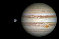
The big question most people have asked is about the part that starts at 00:20, where it shows the Earth and the Moon, and says all the planets in the solar system can fit in between.
Is this true? Well, kinda. They can, but it depends on how you measure things.*
The easy way is to use the average diameters of all the planets, add 'em up, and see if it’s less than the distance to the Moon. If you do that, the planets (note: the video didn’t include Pluto, so I won’t either) combine to 380,016 kilometers (you can find these numbers in lots of places on the Web and do the math yourself to check mine). There’s a bit of uncertainty in some of the planets’ sizes, so call it +/- 100 km. It won’t matter though …
How far is it to the Moon? Well, the Moon’s orbit is an ellipse, so sometimes it’s closer than other times. At its closest (called perigee), it can be somewhat less than 357,000 kilometers between the Earth’s and Moon’s centers. That’s already smaller than the planets aligned, but it gets worse: You have to subtract the radius of the Earth and Moon, since the planets have to fit between them. The Earth and Moon's radii combined is about 8,100 km, making the distance between them more like 348,000 km. The planets don’t fit.
But wait! At apogee, when the Moon is farthest from the Earth, the center-to-center distance is more like 406,000 km, so about 398,000 km surface-to-surface. Aha!
At lunar apogee, the planets do fit, rather comfortably. And there's more: I used the average diameters of the planets. Most of the planets are not spherical, but due to their rotation they’re oblate, or squashed; smaller in diameter through their poles than across their equators. We can make them fit better if we align them through their polar axes. That total distance is 364,799 km. That’s still too much if the Moon is at perigee, but gives us a little more breathing room when the Moon’s at apogee.
Finally, we can look at the average distance of the Earth to the Moon, which is 384,400 km, or 376,000 km surface-to-surface. In that case the planets fit if we align them pole to pole, but not using their average diameters.
So it looks like the video is correct, the planets can fit between the Earth and Moon, if you orient them correctly (note that in the video they align most of them with north up, which actually won’t work; remember most planets are wider through their equators).
But here's the funny thing: The video gives how much room is left over: 4,392 km. I think that reflects too many significant digits, but taking it on its face, I think I know where they got it. The average Earth-Moon distance is 384,400, and the total of the planets’ average diameters is 380,016. That difference is 4,384 km, very close to their figure. But that doesn’t include subtracting the radii of the Earth and Moon! When you do that (getting 376,000 km or so, remember) the planets don’t fit. In other words, if I’m seeing this correctly, the video got it wrong there. Doing it their way it won't work!
But remember, the planets can fit if you wait for the Moon to be at apogee, or if you align the planets pole-to-pole. It looks the video got it right, but for the wrong reason.
OK, fine, I'll give them partial credit there. What about the other claims?
Well, those are pretty much accurate as well. For example, the video states that all the stars you see in the sky at night with your unaided eye are less than 1,000 light-years away. That’s essentially true; only a handful are farther.
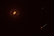
One thing I might quibble about is where the video compares our Milky Way galaxy to the giant elliptical galaxy IC 1101 (Note: In the video they mistakenly label it as IC 1011, which caused me much confusion until I realized it was a typo). In the video they say IC 1101 is 6 million light-years across. That exact number is disputable; IC 1101 has a large fuzzy halo that isn’t well characterized. It’s hard to define a size to an object that kind of fades away with distance from the center, so this becomes an interesting astronomical issue. It’s almost certainly smaller than 6 million light-years, and you can argue for it being much less.
However, I’m quibbling. No matter what it’s way bigger than the Milky Way, so that part of the video is essentially correct as well.
They also show many stars that are bigger than the Sun. This part (as far as I can tell) is also correct, but I want to make a point. Sure, it’s easy to find stars bigger than the Sun, and galaxies bigger than the Milky Way. But that downplays the fact that our star is bigger in size than roughly 80 percent of the stars in the Universe (most are red dwarfs less than half the Sun’s size), and the Milky Way is actually one of the biggest galaxies we know of as well, certainly in the top 10 percent.
It always bugs me, therefore, when people say the Sun is “average sized.” That’s misleading.
Anyway, back to the video. At 02:36 it says every star is orbited by planets, and that’s certainly not true. From what we can tell, many stars have planets, but many do not. What’s interesting, as a gee-whiz kind of thing, is that most stars that have planets probably have more than one. The way the numbers look right now, planets may outnumber stars in the galaxy!
So that point in the video is still valid. There are a lot of planets in the Universe. A lot.
Again, though, these are mostly just side thoughts. Overall, I find the video to be pretty accurate, and it’s overall point is legit: We live in a vast, vast Universe. A lot of it is bigger than we are—a lot is way smaller, too. And while that may be mind-blowing, and even humbling, I don’t at all find it diminishing in any way.
Sure, we’re small. But our minds are big. And we’re curious too. What’s more mind-blowing about that video is that we know enough about the Universe for it to blow our minds! Using science, we learn things, and find out what’s true and what isn’t.
And this gets even better. Because you know what? Our minds are stretchy. These facts may try to explode your brain, but after a while you get used to them, assimilate them, and use them to discover more things. Your mind gets bigger; it grows to accommodate what you’re learned. And those things you learn get no less astonishing, no less wondrous, even as they pile up inside your head.
Knowing more makes you want to know more, and makes you appreciate everything you do know. I’d say that’s pretty good deal.
*Correction, Feb. 9, 2015, at 18:30 UTC: Oh boy, I made a funny mistake when I originally wrote this: I included the Earth when I added up the diameter of all the planets! In other words, I also was putting the Earth between the Earth and the Moon. Oops. I also included Pluto, which was left out of the lineup in the video, so originally I said the planets add up to 395,126 km (using their average diameters). The above text represents the correct math, squeezing Mercury, Venus, Mars, Jupiter, Saturn, Uranus, and Neptune between the Earth's and Moon's surfaces. Sorry about the confusion, and it goes to show you that your algebra teacher, once again, was right: Always check not just your math but your assumptions!


