A journey to Jupiter, without leaving Earth
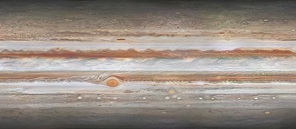
[Image credit: Peter Rosén]
I don’t mean to make this blog all Jupiter all the time, but c’mon. It’s Jupiter.
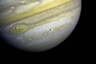
The biggest planet in our solar system is truly a monster: At 140,000 kilometers in diameter, it can be resolved into a disk and viewed with some detail with only binoculars or a small telescope, even at a typical distance from Earth of 700 million kilometers.
So, what happens when you take more than a thousand images of Jupiter from 91 gifted amateur astronomers across the Earth and process them to combine them into a global map that changes over time?
Magnificence.
And I can prove it. Watch:
That incredible video is the product of a group of amateur astronomers in Sweden who organized amateurs from around the world. They tasked themselves to create a high-resolution moving map of Jupiter’s clouds using the combined images from dozens of astronomers. The images were taken across 3.5 months, which poses quite a problem. Jupiter rotates once every ten hours, and it doesn’t have a solid surface: What we see are the cloud tops, which roil and flow and change on a daily basis.
In this case, the task was to create a high-resolution moving map of Jupiter’s clouds using the combined images from dozens of astronomers. Once the images were taken, Christoffer Svenske and Johan Warell still faced the daunting task of combining them. The images were taken across 3.5 months, which poses quite a problem. Jupiter rotates once every ten hours, and it doesn’t have a solid surface: What we see are the cloud tops, which roil and flow and change on a daily basis.
Also, from Earth, we only see Jupiter from one angle. It orbits the Sun in pretty much the same plane we do, and its spin axis is perpendicular to that plane. That means the polar regions are very difficult to observe.
But that’s what computers are for. Once the images were taken, Christoffer Svenske and Johan Warell remapped the images onto what's called a cylindrical projection, similar to the one at the top of this article. Then, Peter Rosén processed them, correcting their color and combining them to make 54 full-planet maps covering different times, then interpolated them to double that number and provide for a smoother video flow*. He also mapped them onto a sphere, so that virtual flybys become possible. Amazing.†
Once they did this, a lot of things became possible. For example, each pixel in the image can be remapped to show Jupiter in different ways, like the cylindrical projection at the top of this article. They also mapped them onto a sphere, so that virtual flybys become possible. Amazing.
There’s a lot to see! The banding on Jupiter is caused by convection — rising and falling air. In the lighter zones, air is rising and cooling, allowing ammonia ice crystals to form. These are very reflective, so the zones are brighter. The darker belts are where air is sinking, and the ammonia is clearer vapor, so we see deeper into Jupiter’s atmosphere.
One thing that struck me is how fast the light-colored equatorial zone region flows relative to everything else. It zips along in an eastward direction, in what’s called a “jet”. Appropriate.
You can see the Great Red Spot to the south, and I love how the air flows around it, creating huge vortices to its left. Lots of other smaller storms can be seen all over the place, too.
I’m fascinated by the view looking down on the south pole. Due to geometry, when we view Jupiter from Earth the equator will in general show the most detail, since we’re looking straight down on it from Earth; closer to the poles, perspective foreshortens details, blurring them. But in the artificial polar projection, the equatorial features are near the planet’s limb (the outer circumference), so they get foreshortened. At the same time, the polar details are still blurred in the original images, so they’re still fuzzy even though it looks like we’re peering straight down at them. The highest resolution features in the polar map are therefore at mid latitudes, where real resolution and remapping balance. Pretty cool.
Mind you, we can’t see that view from Earth! But we do get images of it from spacecraft, like Juno, which just dipped down over Jupiter’s poles for the fourth time in its mission. It’s amazing to see any detail at all near the pole of Jupiter in the images, and still, they managed to show quite a bit there.
This sort of work shows once again what a valuable asset so-called amateur astronomers can be to science; maps like this can be important in identifying features in the Juno images, for example. And I say “so-called amateurs” because that adjective is misleading. The line between professional and amateur has been blurred increasingly over the years; with high-quality digital video cameras and powerful computers to process the data, the sort of thing that can be done by a few individuals more than rivals what professionals could do in the past. It surpasses it, in many cases by leaps and bounds. What used to be the purview of huge observatories is now possible to achieve from someone’s back yard. Incredible images of the heavens, precise measurements of variable stars and asteroids, and more, all because of a revolution in technology.
And, of course, the intense dedication of people who truly love their craft. Don’t discount that. It can go a very, very long way — it can discover entire worlds.
* Interpolation is a mathematical technique that lets you fill in gaps in data by making assumptions about the data around the gap. For example, if a feature in the images moves ten pixels in an hour, then in half that time it should move half that distance. The actual process can be considerably more complex than that, but that’s the general idea.
† Correction (Feb. 14, 2017): I originally said this was done by the Voyager 3 group. That was the name of a project done a few years ago by some of the amateur astronomers involved with this newer project, but is not the name of the current project. Also, I said that Christoffer Svenske and Johan Warell combined the images, but it was actually Peter Rosén who did that. My thanks to Peter for this information!


