Create a free profile to get unlimited access to exclusive videos, sweepstakes, and more!
Why The Dark Knight Merchandising Team Went to War Over the Color Purple
It's not like the character hasn't worn a purple suit for the past *checks notes* 84 years!


For well over 80 years, Gotham's Clown Prince of Crime has been inextricably linked with the color purple. When you think of the iconic Batman villain, you immediately picture his flamboyant sense of fashion meant to reflect an inner sense of sociopathic showmanship. He's an ostentatious circus clown with no moral compass, a cackling proxy of chaos always aiming for the grand effect.
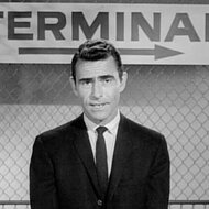
So when it came time to reintroduce the Joker back into the cultural zeitgeist by way of Christopher Nolan's critically-acclaimed The Dark Knight (now streaming on Peacock alongside Batman Begins and The Dark Knight Rises), a member of the Warner Bros. Consumer Products team somehow forgot the immutable aesthetic principles behind one of the company's most enduring comic book properties.
For More on The Dark Knight Trilogy:
Remembering Batman Begins and Its Top-Tier Cast
Former DC Creative Director Recalls Working with Heath Ledger on The Dark Knight Teaser Posters
How The Dark Knight Trilogy Chose Each of Its Iconic Villains
How Purple Sparked Debate Among The Dark Knight Merchandising Team
Chatting with SYFY WIRE over the phone, David Erwin, who previously served as Executive Creative Director of DC Comics, recalls how he wanted to incorporate purple into the multitude of tie-in merchandise as a way to herald the arrival of Heath Ledger's awe-inspiring interpretation of the Joker, who — big shocker! — wears a purple suit in the film.
"There was this one particular person, I won’t mention her [name], but she was really adamant and insisted that the color purple was not appealing to boys," Erwin says. "She thought it was a girl’s color. [She asked] 'Why are we putting a girl’s color on packages?' I said, ‘Well, the villain is the Joker and his suit color is purple and he is associated with the color purple.’"
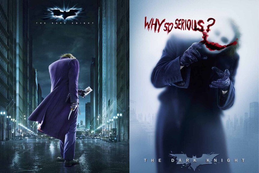
Erwin continues: "We had meetings twice a week and every time, she would bring up, ‘Why is there purple in the packaging?’ The more she complained about it, the more purple I kept putting into the package. So, at the end of the day, you go and look at the packaging for The Dark Knight, you’ll see a third of it is purple."
While the purple color scheme has almost never wavered across every onscreen depiction of Joker (be it animated or live-action), his general sense of fashion has evolved with the decades. Speaking to IGN in 2008, The Dark Knight costume designer Lindy Hemming explained that the antagonist's clothes were reimagined for the grounded, seedier world of the Nolan trilogy. And for good reason. This take on Bruce Wayne's arch-nemesis is, perhaps, the scariest version we've ever seen — a far cry from the bubbly personalities of Caesar Romero and Jack Nicholson.
“He’s certainly not a dapper, dandy gentleman in this film," Hemming said. “Whatever is wrong with him, it means he doesn't care about himself at all, really. We were trying to make him sort of a... I don't want to say vagrant, but his look in this film has a much punkier feel. Anarchic feel. Scruffier, grungier, and therefore when you see him move, he's slightly twitchier or edgy."
If you want to revisit Nolan's whole game-changing series, the entire Dark Knight trilogy is streaming now on Peacock.